Thor: God of Thunder (Wii)
My role in the project
This was my first design job, and I could not think of a better first assignment. I was given Vanaheim, one of the Nine Realms, and what would become the setting for chapters six and seven. Vanaheim had yet to appear in MCU cannon, and was largely unexplored and undefined in years of Marvel storylines. Even the original Norse mythology merely references it obliquely. I was given a few key moments, certain story beats which had to occur, and the rest was up to me to create. I created the initial story draft, level layout, puzzle designs, and timed the introduction of new enemies, and new powers through the level. When they were approved I began to implement them, taking both stages up to an alpha level of quality.
Vanaheim


Teaching a god
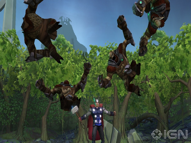
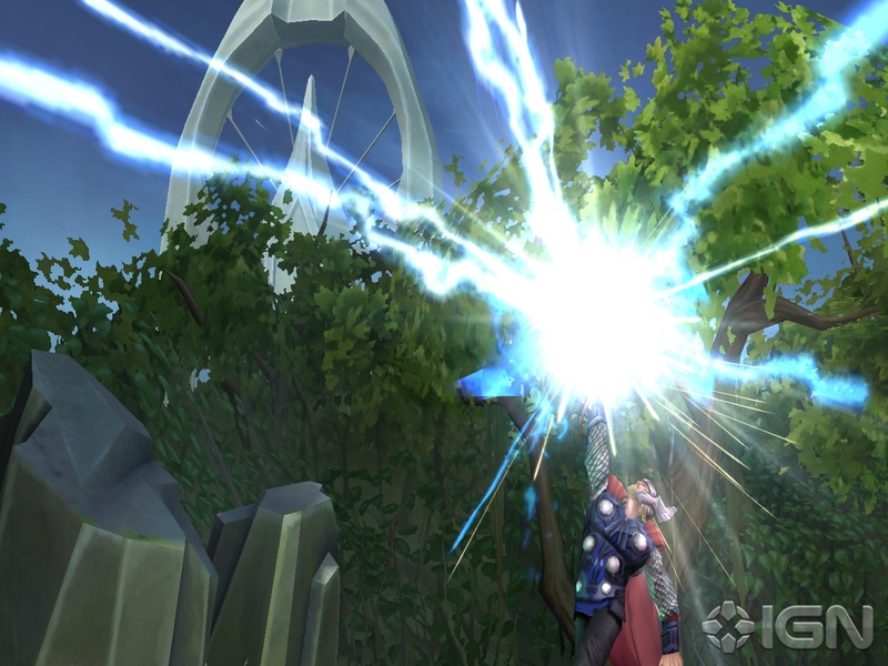
Thor on the Wii was unique from the PS3/360 version, it had it's own story and many unique gameplay mechanics. Vanaheim saw the the introduction of the Lightning bolt power which allowed the player to point the Wii remote at the screen and zap anything they could see. Being able to literally smite your enemies where and when you wanted posed a challenge for encounter design.
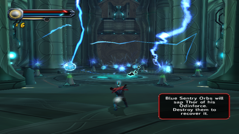
There were a number of solutions, each of which would guide level and encounter design throughout Vanaheim. One solution was to ensure the player had enough targets, so that prioritization was important. Working with the combat designer I added enemies which drained the "Odinforce" from Thor, so that at times the player would have to rely on pure brawn. I added elements to the levels which reacted poorly to being hit by lightning, to discourage blindly spamming lightning.
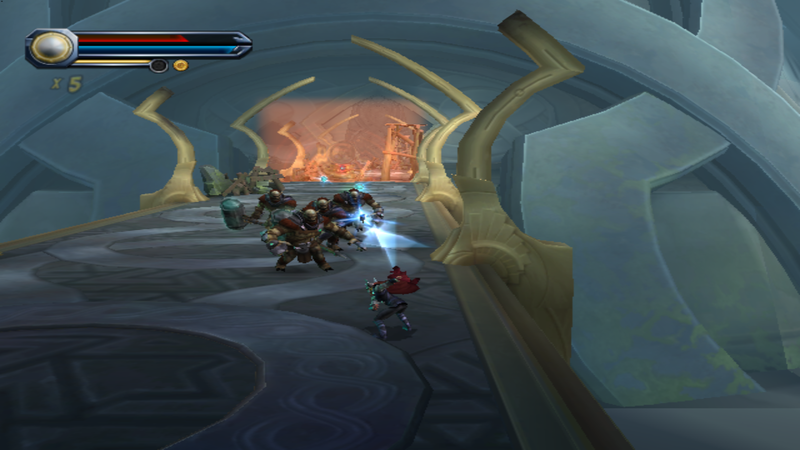
Then, to balance out the discouraging factors I also added buttons in the environment which were activated by the bolts, and deactivated with smash attacks. The buttons and enemies were connected by a power flow motif in the form of yellow and orange lights that ran through the level. These conduits would visually lead Thor through the labyrinthine structures, and their power states created puzzles to open doors, disable turrets, and power force fields.
Overflowing with Ideas
When I first approached the design of Vanaheim I was overloaded with hundreds of ideas. In an effort to capture all of them, without getting too precious with any of them, I began to make note cards for each. A few of the more comprehensible cards are pictured to the right. Some of the cards were aesthetic drafts for how the spaces would look, as I worked out how that would influence level layout. Some of the cards were mock-ups of individual rooms to be sorted, resorted, and laid out to form a level. Some of the early designs for rooms were meant to resemble Celtic knots, these did not work well with the spline camera and so eventually just became part of the aesthetic inspiration. Finally some of the cards showed drafts of puzzles, gameplay mechanics, and a glass floor bridge that made it to white-box prototype, but not much farther.
First Paper Map
I created the papermap for the two Vanaheim levels in Inkscape by essentially taking my favorite room cards, and simply stringing them end to end. The rooms told a linear story, from Thor’s crash landing and investigation of an unfamiliar world, to the introduction of a new enemy, and finally to the big fight at the end where King Ulik would be revealed. In between story driven rooms, were introductions and tutorials for the lightning bolt mechanics, and introductions to each new enemy type.
Unfortunately for me, while the flow of the level worked great on paper, my first papermap drafts for Vanaheim were a master class in what not to do when working with a third person camera. Especially so for a camera which would be run by a spline, and couldn’t be controlled directly by the player at all. Small doorways, dead ends, surprise attacks from behind, switchbacks, and claustrophobic rooms.
Once blocked out in the editor though these flaws became painfully clear and I was able to adjust and cut where needed. This is not one of my shining moments as a designer, it was however a formative one, full of mistakes I won't repeat. A side effect of this crucible is that almost none of the original rooms seen here are even recognizable in their the final form. There were a number of ideas here that didn't make it into the final game in any form. The force field floors (light blue), as well as nearly any form of verticality were the big cuts, along with a puzzle where the player would draw runes with lightning, which was to be found in the hexagonal room.
Paper maps are still an important part of my design process, but I’ve learned a few lessons for their use since then… When you work in 2D it’s harder to think in 3d. Paper maps are very helpful in developing narrative pacing. Iterate with paper maps, even after gray box. If something isn’t working in the 3d world, look at it again in 2D. Don’t get too precious with their exact dimensions, how a player character fits into the world, with their unique movement and gameplay, is something it’s going to take time to learn, and when you do, your original maps proportions may be way off. Basically, don’t be too precious about them. As the old saying goes, If you want to make a god laugh show him your paper maps.
All images above have been used with the permission of Red Fly Studios. Images are not to be duplicated or published elsewhere.


